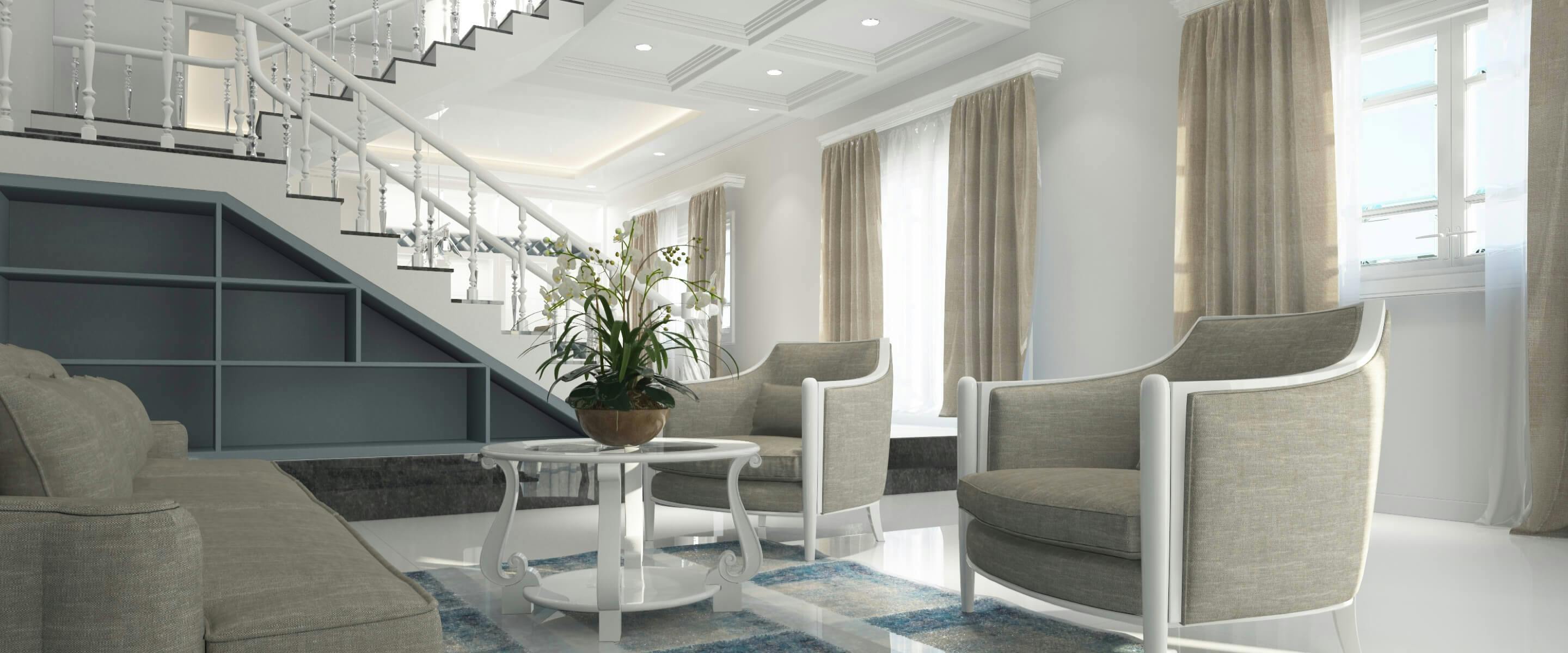
Renovating your rental property can be an overwhelming and expensive process. It's understandable that most landlords push this kind of project to the back burner. However, periodically renovating your rental property has a ton of benefits, such as making your unit more attractive to potential renters, keeping it aligned with market value, and potentially preventing a much larger renovation project later down the road when you want to sell the apartment.
As you consider what to renovate, it's important to know which trends to avoid. Kitchen and bathroom trends can be especially subject to the popularity of a moment. Once that moment has passed, you can be left with an apartment that looks very outdated, which can turn potential renters off.
When deciding which renovations to undertake first, start with the oldest, most dated, or shabbiest area of the unit first. The goal of any improvement is to refresh the space and make it seem brand-new again. Begin with the project that furthers this goal the most. You should also give more attention to what will wear the best over the life of the rental.
Here's our list of the top seven home design trends to avoid when renovating your rental property.
#1: Granite Countertops
Yes, we know you've seen a ton of granite countertops on home improvement shows. It can seem, at times, like everyone wants one. As with any other trend, the overwhelming popularity of granite means that it will be the old flavor of the decade at some point, just like avocado-colored appliances in the 1960s. Granite countertops will date your property.
Also, granite is expensive. Marble, quartz, or treated laminate counters are much more affordable and equally durable.
#2: White-on-White Bathrooms
White-on-white bathrooms, where walls and fixtures are all white, look dazzlingly clean and contemporary to some viewers. They've also been touted as enlarging the look of the room. However, unless all-white bathrooms are kept very clean, they'll look dirty. If there's one thing white does not do, it's concealing dirt and grime. And to put it quite frankly, how many renters keep their bathrooms spotless all the time?
It's smarter to choose a neutral pastel and add natural elements to your rental unit's bathroom, as it minimizes the necessary upkeep and is equally attractive.
#3: Lack of Environmental Friendliness
Millennial renters—so, those who are currently in their 20s and 30s—are very concerned with energy efficiency and environmental pollutants. You'll make your unit more attractive to Millennial renters (of which there are many) if you can advertise that your renovations are environmentally friendly.
So, which trends should you avoid? Don't buy paint based only on price and color. Choose paint with low or no volatile organic compounds (VOCs) because they pollute the environment less and won't bother chemical-sensitive renters. Then, advertise that fact. In addition, don't buy lightbulbs or fixtures with no attention to their energy efficiency. Instead, look for Energy Star labels to ensure maximal energy conservation.
#4: Hanging Pots & Pans
A group of hanging pots and pans in the kitchen was a popular trend in the recent past. It was thought to make the kitchen look homey and accessible. Many hanging pots and pans were placed over the kitchen island if there was one.
Now, the idea of hanging kitchen pots and pans just looks dated and cluttered. The current trend is to have accessible, large drawers to store kitchen pots and pans.
#5: Distressed Cabinets
Like distressed jeans, distressed cabinets were all the rage not too long ago. Guess what? They just look old. Don't distress your kitchen or bathroom cabinets! In fact, if your property currently has them, they're a great place to start your renovation project.
Choose a neutral color or finish for cabinets. It's not a smart idea to go too light because, again, light cabinets will show dirt, dust, and wear more than a darker shade. Very dark tones, though, like dark gray or black, will make the room look smaller. Light or medium walnut or pine stains, or basic colors such as ivory or even gray-blue, are suitable choices.
#6: Faux Finishes
Faux finishes for painted walls had their moment in the sun--that moment is no longer. Faux finishes like marble or wood not only look outdated, but they are idiosyncratic enough to turn off potential renters.
When painting or redecorating walls, choose a neutral shade that's easy to maintain. Bright ivory or pale yellow or blue are good choices. If you want to go fancier than paint, choose a neutral wallpaper that will age well--but most renters today tend to prefer paint, which is also easier for you to touch up after they move out.
#7: No Window Treatments
Many interior designers chose to forego window treatments a while ago. The idea was to replicate the minimalist style of urban lofts. The problem is, it's too minimal. Window treatments exist for a reason: They provide privacy from the outside world. They also hold in heat in the winter and keep out heat in the summer.
So, say yes to window treatments! Blinds, shutters, and curtains all have a purpose. Choose the easiest to maintain and most cost-effective. Simple styles and neutral colors work well.
Consider Preferences & Longevity
One last tip: Always consider the preferences of your future renters when renovating your rental property. If you're looking to spruce up your rental, increase its attractiveness to renters, and keep in touch with design trends, renovations are the way to go. Just be sure to avoid implementing dated trends, or ones that could quickly become dated, that can turn renters off or become a maintenance issue down the road.
